Emerald and Dusky Pink
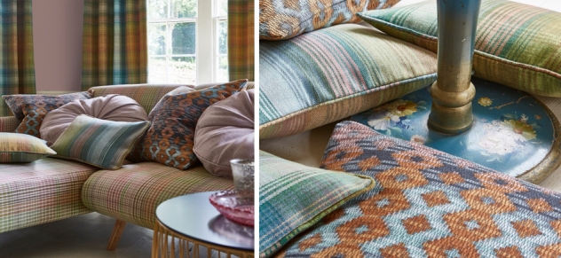
In a welcome change to the usual burnt orange hues seen at this time of year, clay-like shades of pink are adding a more muted look to autumnal interiors.
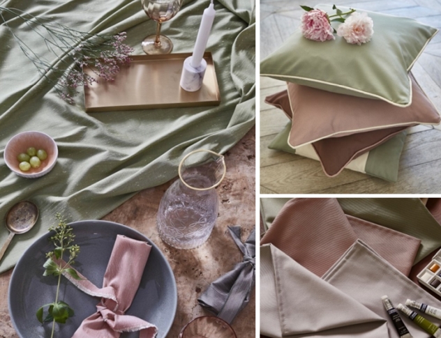
In a harmonious combination, these shades work beautifully together as they sit opposite each other on the colour wheel. The dusky pink offers feelings of calm and tranquillity, whereas the jewel-bright green adds a touch of vitality to an interior.
The dusky pastel shade is being paired with the rich tones of emerald and peacock blue across velvet qualities.
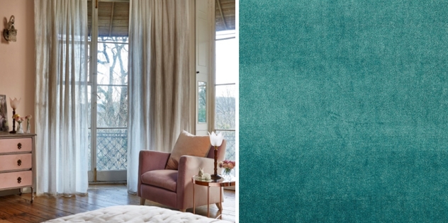
Our luxe Velour fabrics are perfect for on-trend velvet upholstery that has been popular in both of these colourways. Muted pink shades such as Rosebud and Petal look striking when contrasted with peacock blues such as Pacific.
This bold colour combination has also worked its way into the maximalist trend, with whole rooms being painted in bold peachy-pinks with pops of emerald green. Our plain collection, Magical, offers the perfect irrdescent quality to accent accessories such as cushions and curtains in shades such as Peacock and Marine.
In a more subtle take on this trend, plains such as Tussah and Core offer a softer colour pallete, perfect for introducing these shades into your living space.
Tussah, a new addition to the PT portfolio, offers a spectrum of delicate pastels for more muted settings. Similarly, Core colourways such as Peacock and Shadow incorporate the boldness of the colour combination, yet in softer qualities.
Pizzazz has also adopted these cool pastel tones for autumn, with muted shades of pink, green and blue running through the Calypso colourway. The collection is perfect for adding these colours into your interior with the autumnal, upholstery-weight checks, stripes, weaves and herringbone twills.