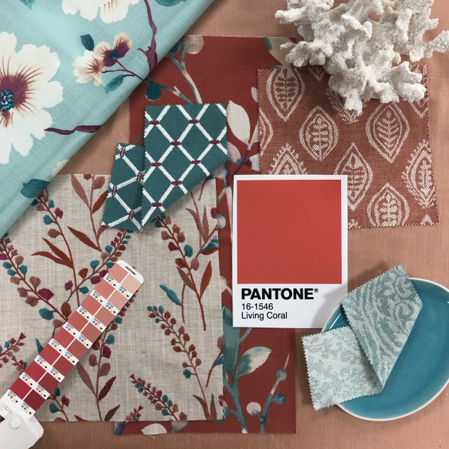
Living with Living Coral
Every year, Pantone hand-pick the shade they predict to be the Colour of the Year. The decision is influenced by all aspects of the world we live in – fashion, art and design, as well as new lifestyles and digital influences.
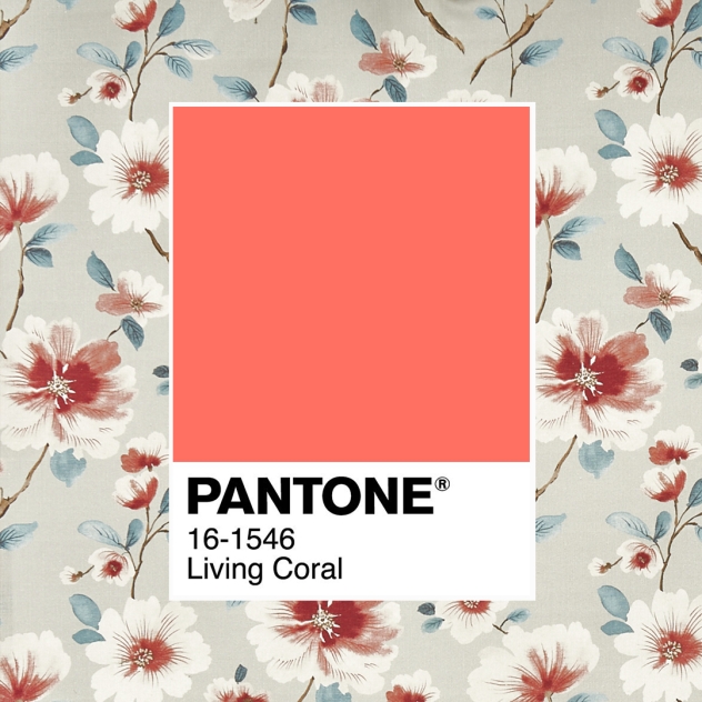
For 2019, the colour experts chose the energising Living Coral, a ‘life-affirming’ shade that embraces warmth. The coral hue’s golden undertone symbolises nourishment and encourages socialisation outside of the digital world.
Unlike Pantone’s 2018 Colour of the Year, Ultra Violet, Living Coral is a shade that can be used all year round.
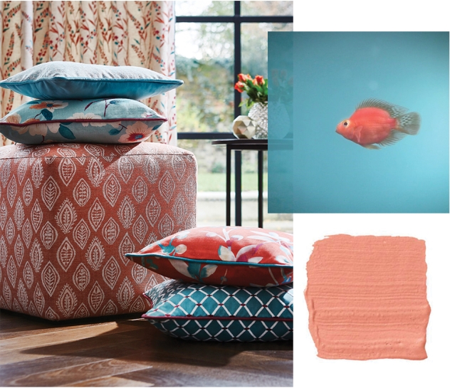
Originally inspired by coral reefs, the colour is associated with summer. However, the coral shade, combined with terracotta and dusky pinks, offers the perfect warming winter interior.
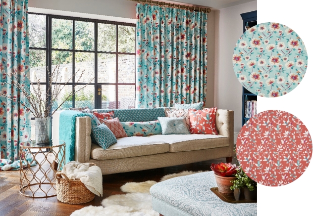
As we’re heading into spring, we’ve paired the Colour of the 2019 with vibrant teal and turquoise shades, a colour combination that reflects the contrast of coral in the ocean.
This bright colour palette works perfectly when updating your home for summer. As Pantone describes Living Coral as a sociable, nurturing colour, the shade is most at home in communal spaces such as living rooms, kitchens and dining rooms.
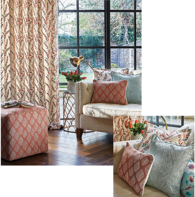
It’s easy to add touches of these coral and turquoise shades into a more neutral living space. The coral helps to re-energise an interior ready for the warmer months. Incorporating cushions and curtains in fabrics such as Trebah and Abbotsbury give a vibrant, yet fresh look for spring or summer.
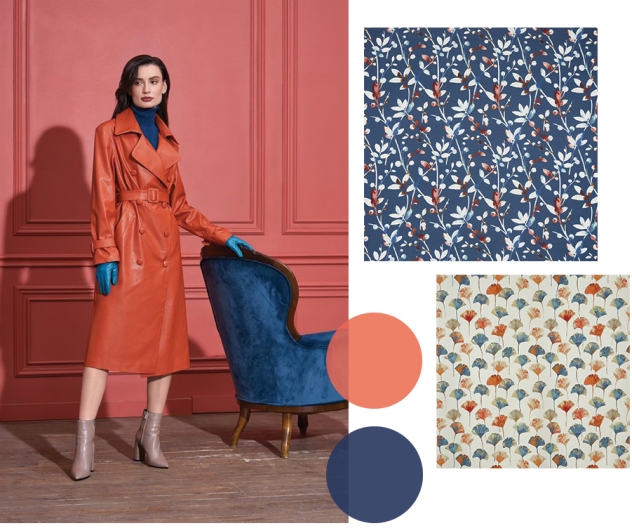
If you’re feeling braver with colour, opt for a darker blue and contrast coral with bold cobalt.
This coral colourway works in harmony with floral designs, adding to the feeling of summer. Fabrics from Malibu help to bring the outside in with foliage inspired patterns in more orange toned coral.
Take a look at our latest Pinterest board Living with Living Coral for more inspiration on how to incorporate Pantone’s Colour of the 2019.
.