Colour Blocking
Indulge in palettes of vibrant hues and say hello to the trend for colour blocking.
Turn up the saturation and create maximum drama in your space with snippets of character scattered throughout the room. From warming shades that cocoon and comfort to vibrant, trend-led palettes that invigorate and inspire, select your favourites to create truly uplifting, cohesive schemes.
Originating in the fashion industry, this enduring trend has since taken the world of interiors by storm, thanks to its ability to create truly impactful spaces. With colour having such an impact on our mood, surrounding ourselves with vibrant, uplifting hues is ideal for creating spaces that encourage positivity and happiness. Whether making the smallest additions or most intense statements, dive in below and discover how you can embrace a life in colour.
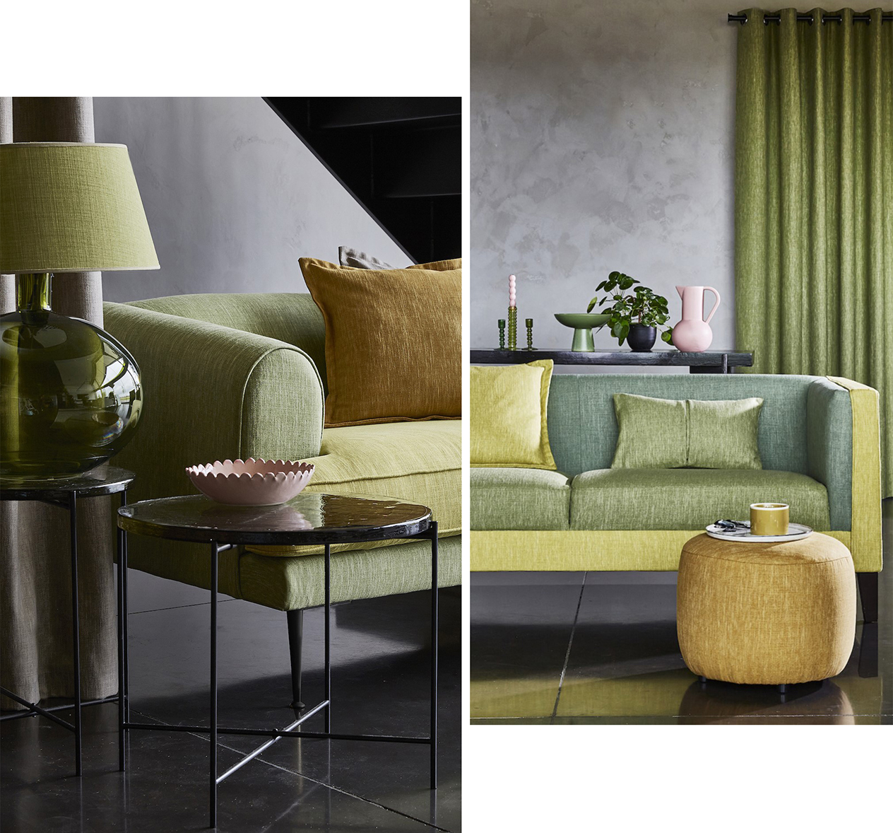
Stick to Two or Three Complementary Hues for a Striking Interior
Pair shades that contrast effortlessly for a scheme that looks unexpectedly harmonious.
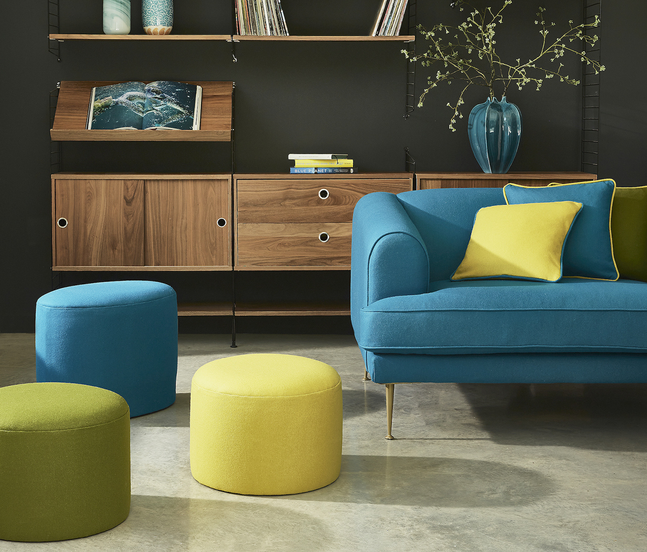
Buxton Collection, Ingleton Collection
Found on opposite sides of the spectrum, complementary colours are those in highest contrast of one another, and when presented together therefore make the loudest statement. A complementary pair we love is blue and orange. This unexpected duo has an unexpectedly satisfying impact when paired together. Go for vibrant teals or rich indigos to truly complement more vibrant orange finishes. Add in lighter denim blues for a cohesive scheme, or swap out orange for vivid shades of lime for an unexpected twist.
Swap Out Shades as the Seasons Change
Keep your space feeling fresh and suitably inviting year-round, by updating colourways featured prominently within your scheme.
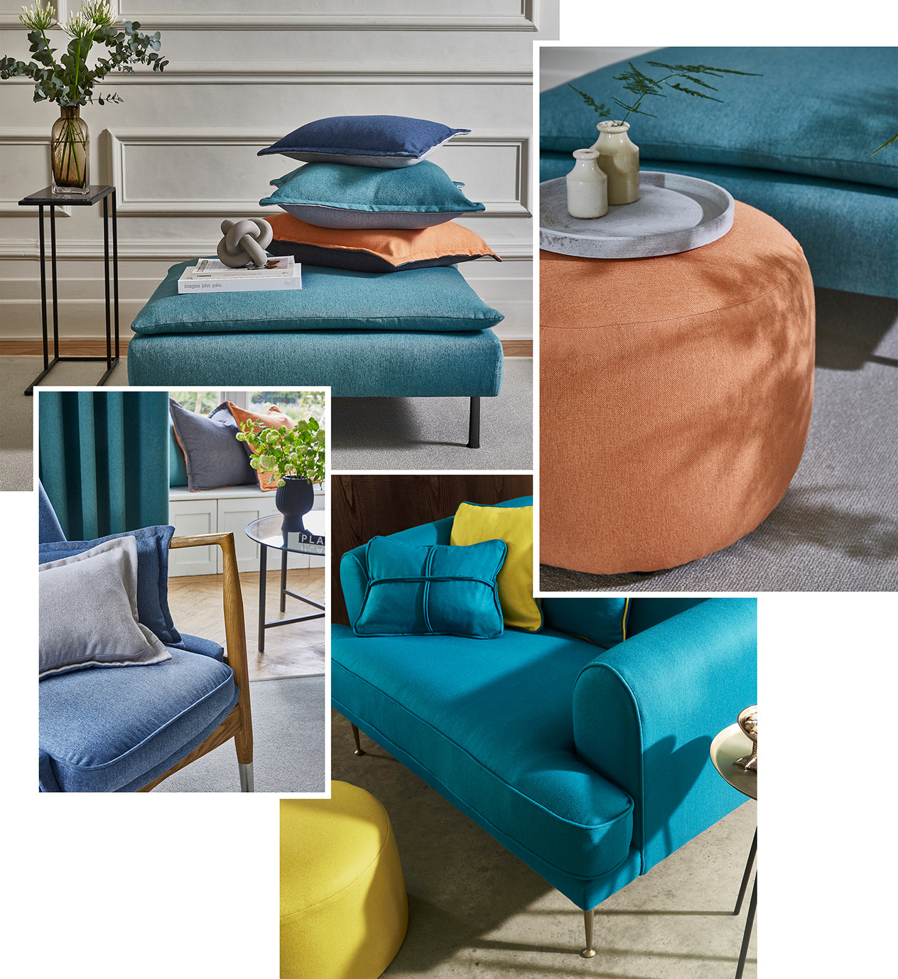
Saxon Collection, Ingleton Collection
Soft furnishings such as cushions and throws are perfect for updating periodically as the seasons change, to keep your space looking fresh and inviting year-round. Reserve warming palettes of amber, rouge, and crimson for the Winter months, adding in highlights of gentle pastels to keep things suitably light and refreshing. Swap out for refreshing tones of citrus, turquoise, or fuchsia during the summer months, for spaces that resonate with the outdoors. Present neutral, versatile tones upon larger expanses of furniture within the room, ensuring that smaller soft furnishings are going to coordinate year-round. Alternatively, utilise predominantly natural materials such as wood as blank canvases for conversational designs.
Maximise Impactful Schemes with Intriguing Textures
Look to wonderfully tactile finishes for adding extra elements of interest.
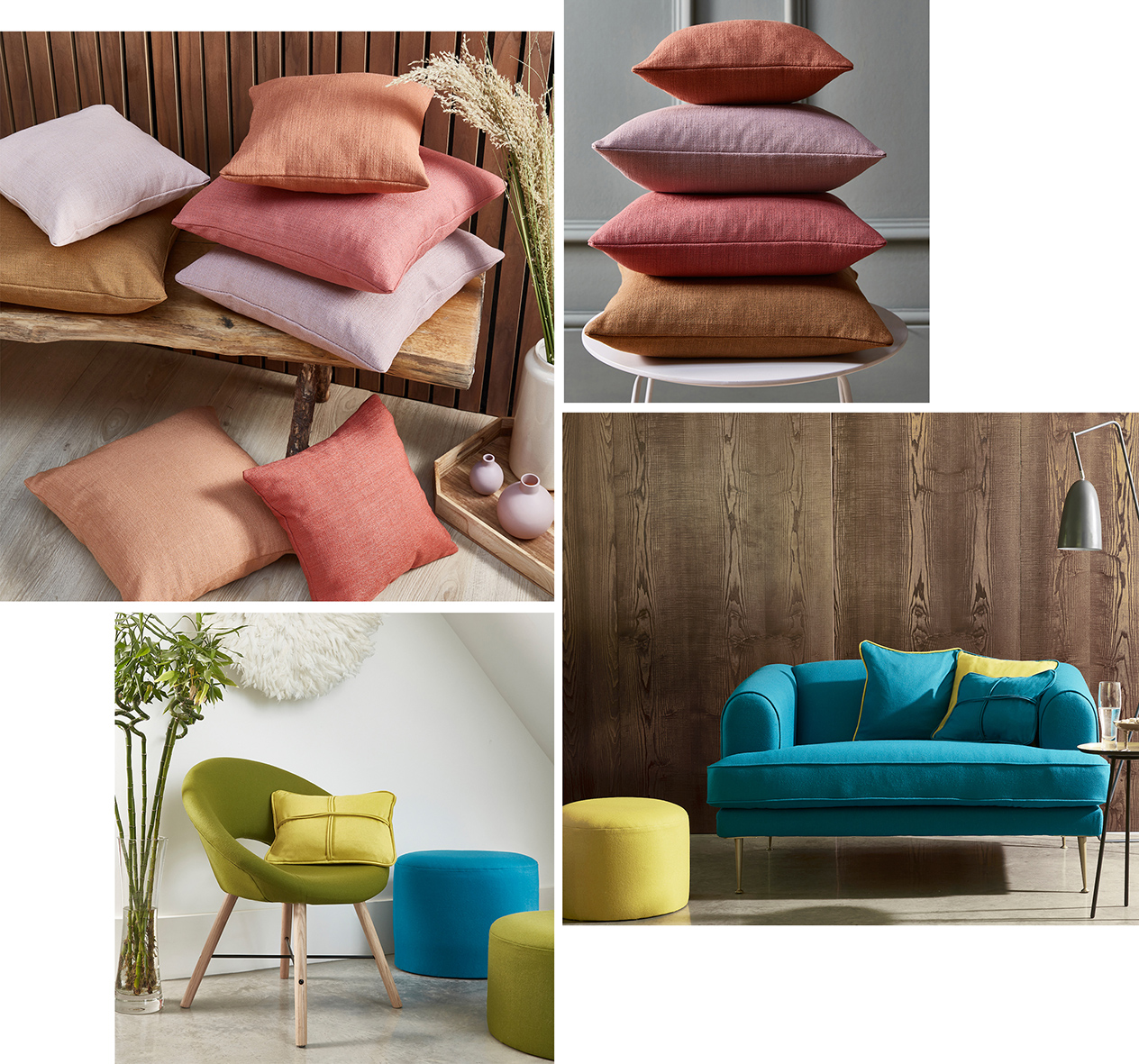
(From Left to Right, Clockwise) Velour Collection, Buxton Collection, Anderson Collection, Kielder Collection, Ingleton Collection
Consider sumptuous chenille designs or irresistible velvet finishes for added layers of luxury, whilst stonewash marl effects look the part in a range of spaces, styles, and projects. For a harmonious blend of form and function, look to vibrant, inherently FR designs that make themselves at home in both residential and commercial settings. Alternatively, opt for durable StainGuard designs that remain contemporary and vibrant for years to come.
Stick to Variations of a Colourway for a Soothing Space
You don’t always need a myriad of vibrant, contrasting tones to make an impact.
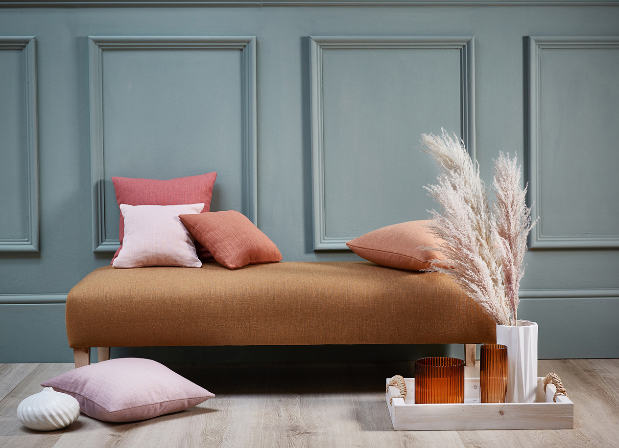
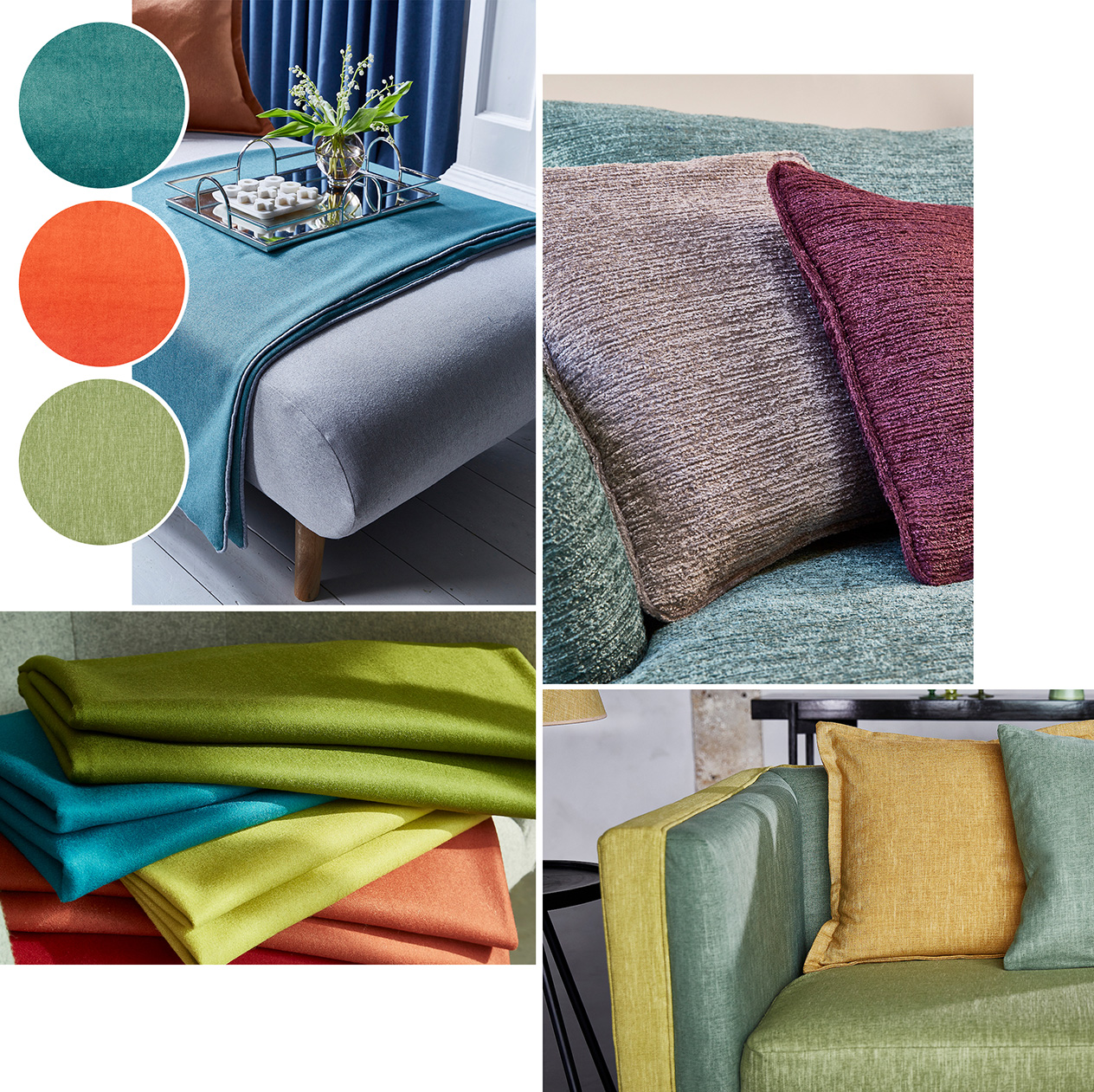
Colour blocking can also be carried out effectively with variations of one or two shades, too, so opt for a spectrum of tones. Pair richer hues such as burnt orange, crimson, or rouge with more delicate tones of lilac and violet. Create a balanced look by evenly distributing variations of your chosen shade throughout the room, pairing with a variety of textures and natural materials to maintain an interesting space.
Add In Flashes of Unexpected Colour with Accessories
Extend your scheme through trinkets, accessories, or even fixtures.
Small accessories present an opportunity to add unexpected pops of colour that you wouldn’t typically pair with other hues in your scheme, without looking too out-of-place. Why not create an unexpected twist with verdant shades of emerald, sage green, and amber paired with pastel pinks in candles, vases, or trinket dishes?
Start forming your own colour blocking scheme in our product search. Why not order some samples too?
Locate your nearest stockist here
Take a look at our latest Pinterest board for more inspiration