How to Create a Festival of Colour in the Home
Introducing Maharaja, Prestigious Textiles’ new collection of bold prints and bright colour, inspired by Indian Summers.
With the popularity of energetic colour schemes on the rise, here at PT, we have been consulting with our design team to find the best tips to transform your home into a festival of colour.
Be adventurous with pattern and a contrasting colour palette to bring personality and joy into the home.
Step into spring and inject uplifting colours and lively prints into your interior scheme to emulate a happy home, full of personality. Explore dynamic colour schemes inspired by blossoming nature and grand festivities of India with Maharaja, a collection full of conversational prints and embroideries designed to inspire vibrant décor schemes.
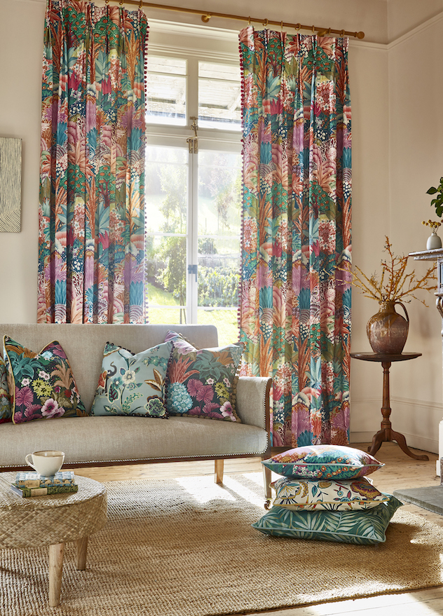
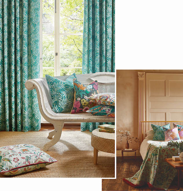
Pattern on Pattern
Layering busy patterns can be overpowering, but being brave with vibrant prints in a similar style and theme can create a confident and sophisticated look.
The lively landscapes and playful elephant designs of the Maharaja collection all have the same hand painted feel, bringing cohesion to a scheme and complementing one another, making the rich, contrasting colours easier to co-ordinate. Decide on a design style for your patterns, and even the busiest of fabrics will work together for a cohesive look. Mix conversational prints with textural embroideries for added depth and wow-factor.
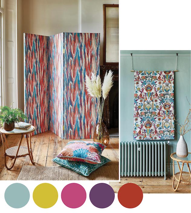
Uplifting Brights
Colour has an important part to play in interior design and doesn’t just affect how a room feels, but how we feel in a space.
Energetic colours will inject happiness and excitement into the home but controlling them can be intimidating. Try working with a colour palette that packs a punch rather than focusing on a single hue. Balance energising tones of red, pink and yellow with cooling shades of blue to keep a feeling of calm in a bright scheme. Be playful with the colours and paint in unexpected ways by adding colour to radiators and skirting boards for a dynamic take.
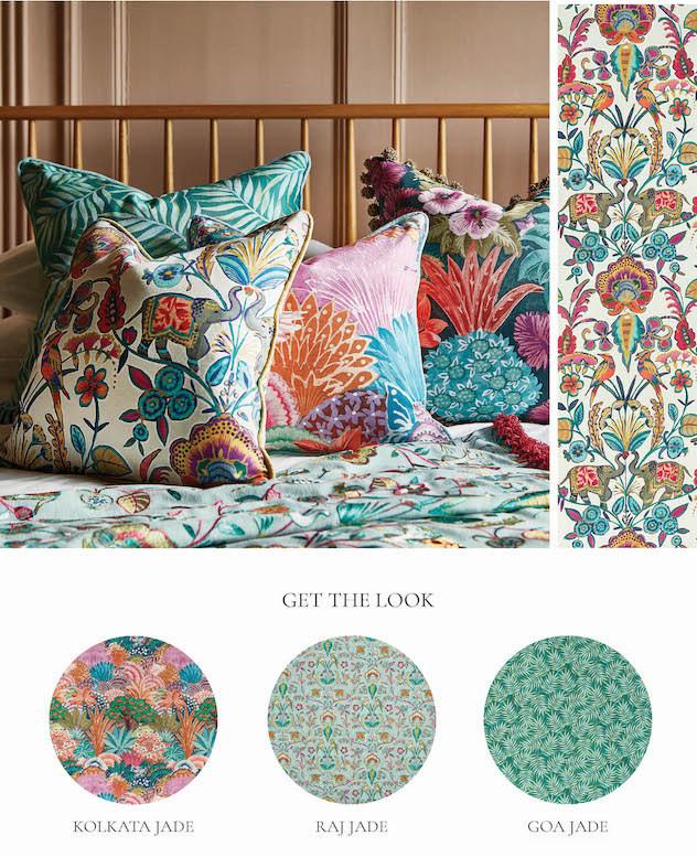
Easy Energy
Introduce white or neutral tones for a pared back look.
Introducing white or warm neutral tones with matching hues place the bold prints at centre stage without overwhelming the colour palette, giving a luxurious and sophisticated finish to a homely, uplifting scheme.
Bring warmth to cooler colours by pairing bold prints with textured wood and rattan. Go a step further by adding statement pieces of ornate furniture to compliment detailed patterns and create depth. The decorative florals and delicate dot work of the Kerala design sit perfectly with the carefully crafted elements of ornate furniture, giving a decadent and luxury finish.
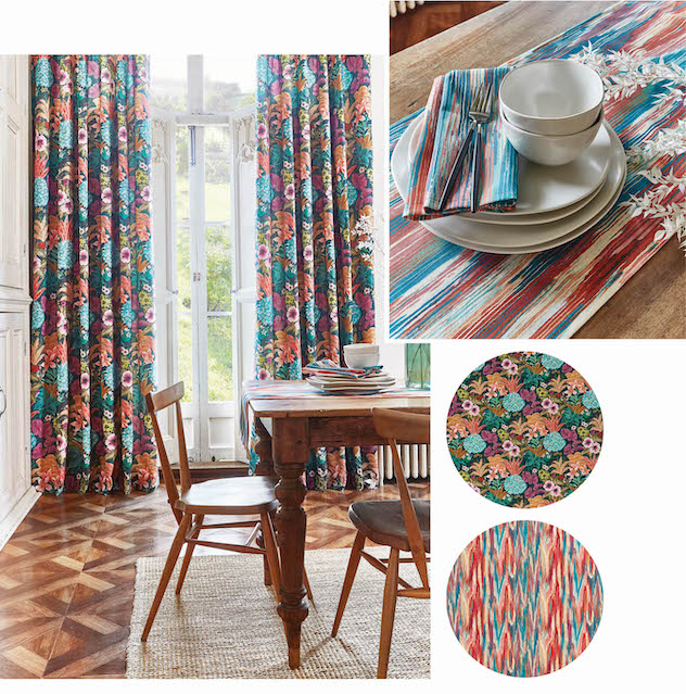
Dazzling Dining
Kitchen and dining areas are the hub of family life and an exciting table setting creates a joyful space to bring people together.
Carry uplifting colour through to the kitchen with co-ordinating curtains, statement table runners and napkins. Layer vibrant prints and embroideries in keeping with your chosen palette for a cohesive, confident look to give energy to the heart of the home.