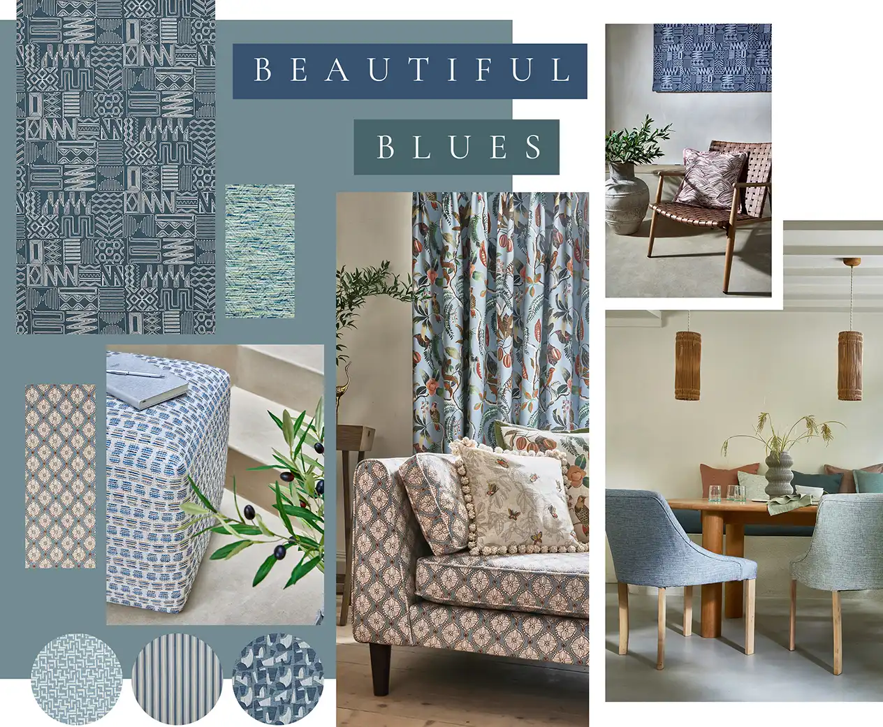
The Evolution of Blue in Interiors
Using blue in the home is always a good choice, and this rings true now more than ever.
The way we are using blue is changing, but its positive effects on the home still remain the same. Its endless appeal can be attributed to its calming, emotionally grounding nature.
Not only is it timeless, but it complements a range of spaces and styles. You can pair blue with a plethora of other colours too. We have spotted a shift towards more layered schemes, though. In these, designers use a blue in a number of different ways, to create depth and interest. From layering shades to pairing with unexpected colours, the use of blue has evolved. Discover more below.
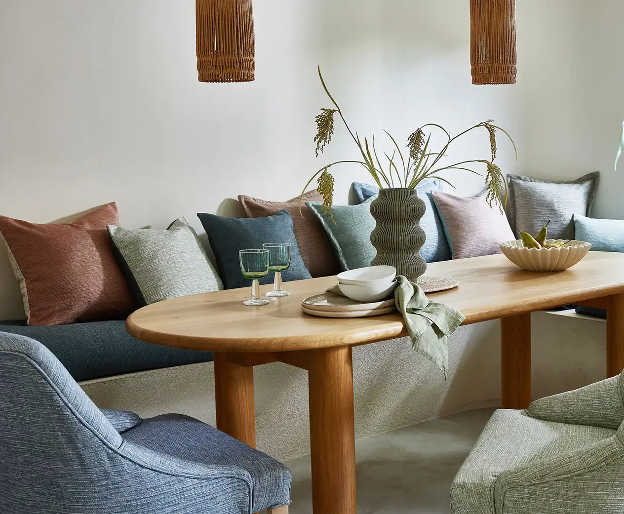
Layer Various Shades of Blue
Create depth and visual interest with several different tones.
(From Left to Right, Clockwise) Tambo Collection, Rustic Persian Collection, Summer Renaissance Collection, Java Collection, Brompton Collection, Tuscany Collection, Camden Collection
This season, we are getting creative with our use of blue. Many of us now know that using a single colour works best when layered in multiple shades. Delicate powder blues look striking against a deeper navy or cobalt. Add in snippets of other shades such as seafoam. Use a variety of textures to create further interest. Consider a sky-blue weave for your upholstery fabric alongside a navy-blue striped curtain.
Pair Blue with Pattern
Bring blue to life by combining with a pattern or two.
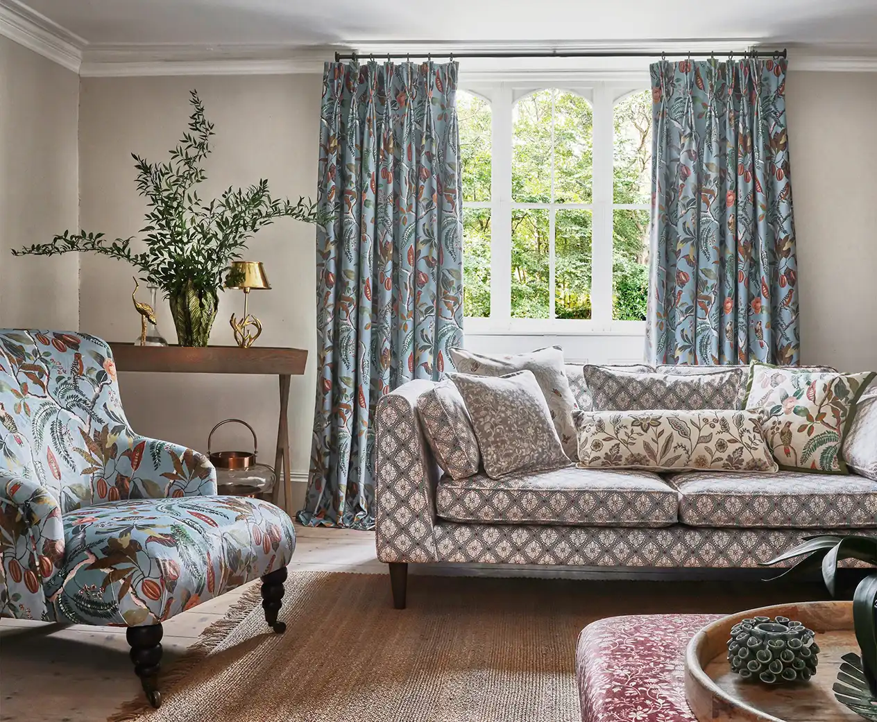
Depending on the style of your space, blue works well to complement a range of different themes. Correlate your shade of blue with the design or print. Rich teal shades can work well with conversational finishes, such as botanical florals. Use these for a curtain or armchair to create a focal point. Alternatively, a charming, country-cottage inspired design pairs effortlessly with cornflower blue. Don’t feel as though you have to stick to this, though. Experiment with different tones and patterns for a beautiful contrast.
Complement Blue with Other Colourways
Amplify the impact of blue in the home, and don’t be afraid to break the rules of colour.
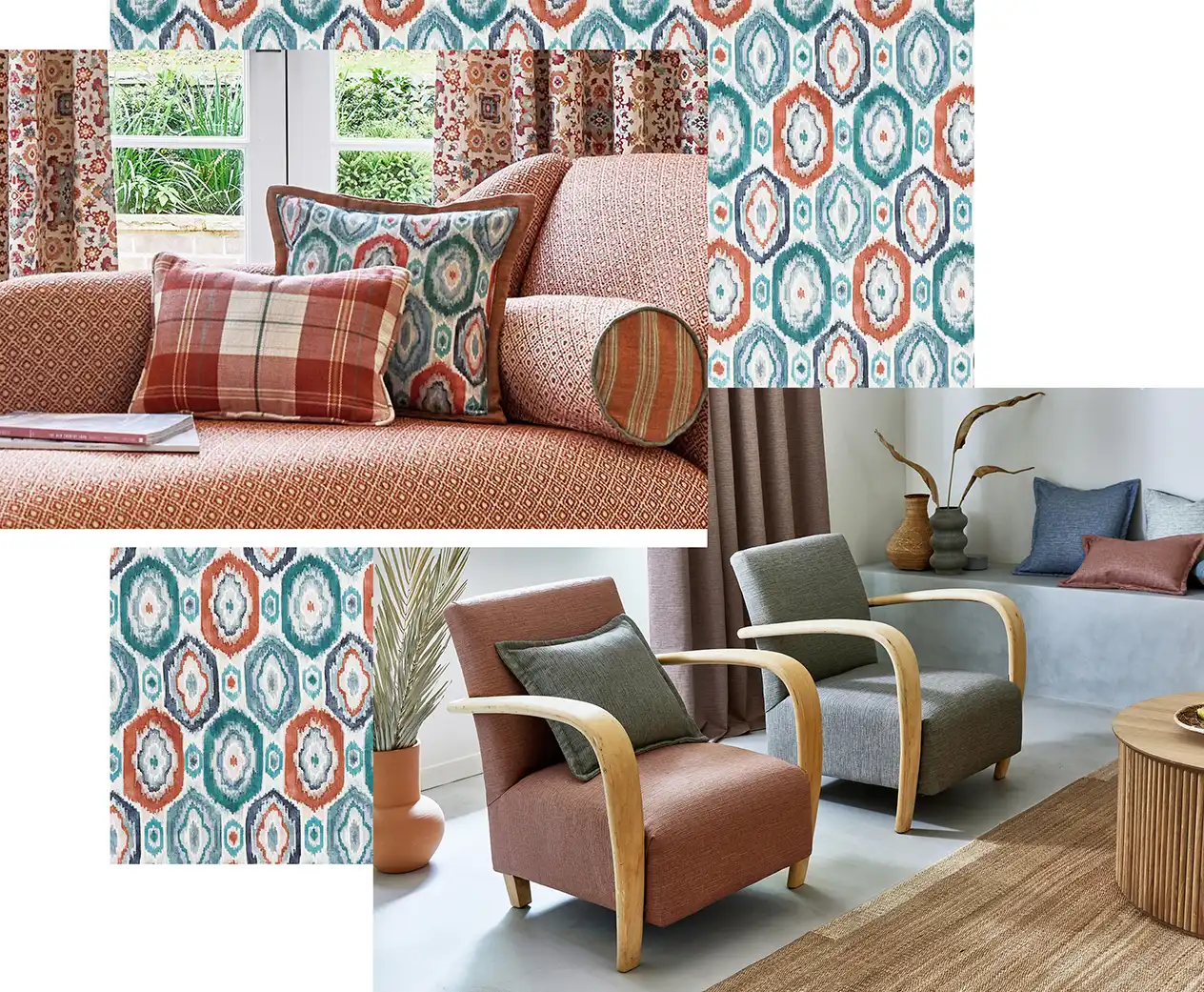
Rustic Persian Collection, Java Collection
A safer choice for a neutral, white has always worked with blue. Its bright nature allows blue to bounce off. More recently though, blue itself is being used as the neutral. More vibrant shades such as deep reds are then introduced. Choose a lighter blue for a striking contrast. We have seen this combination used in a range of beautiful spaces recently. Blue and brown is also still used by designers. Choose a moody teal to go with a rich terracotta shade for a luxurious feel.
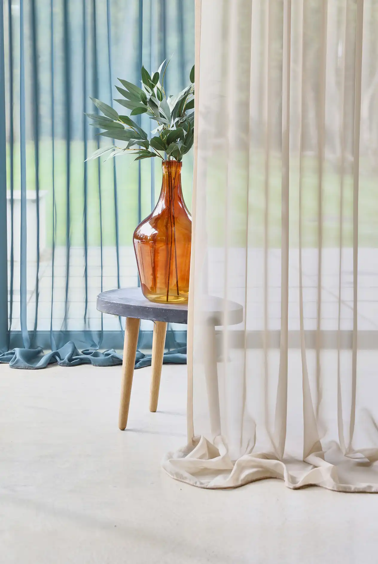
Introduce a Touch of Blue in Every Room
Tie your home together with a thread of blue throughout.
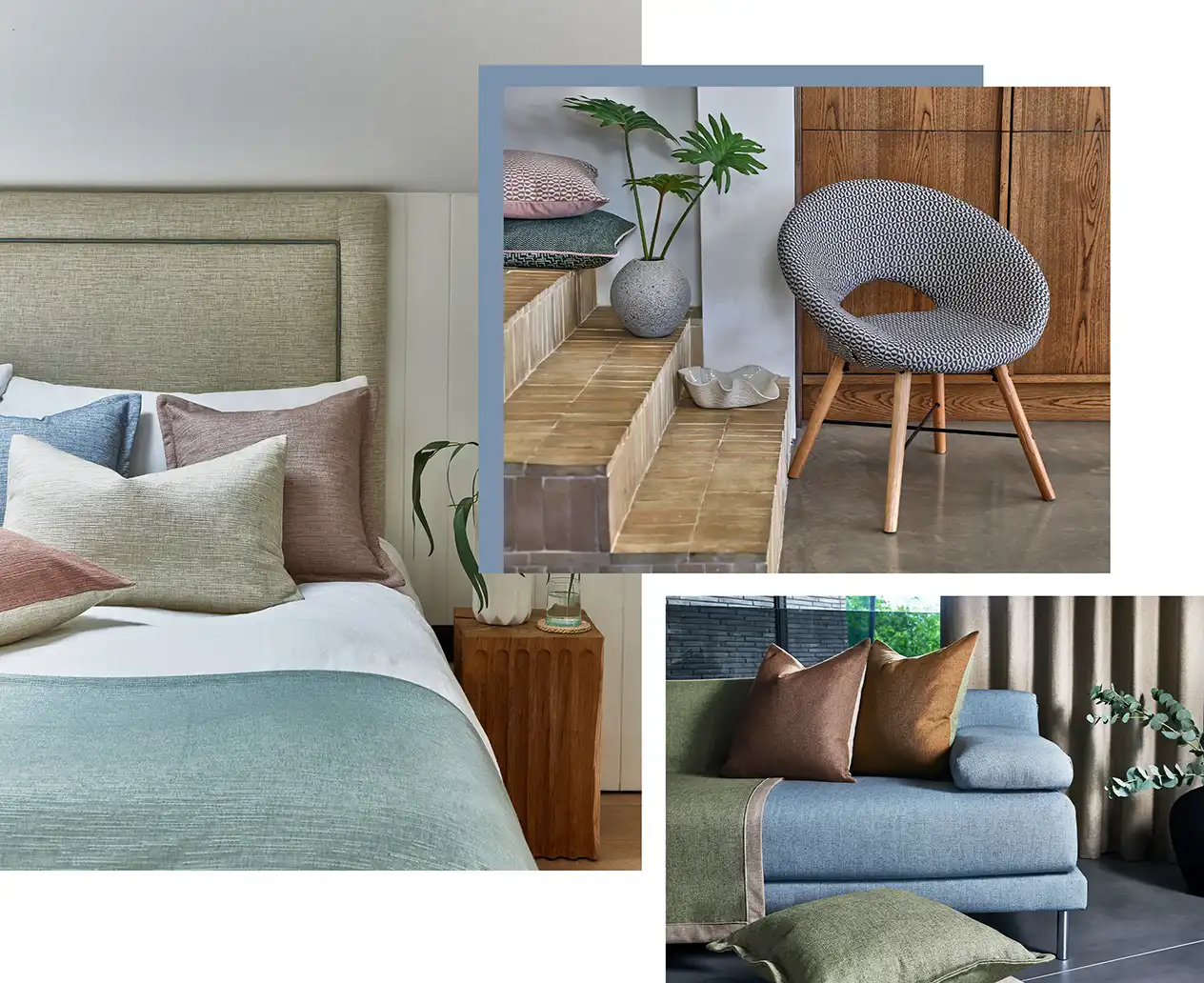
(From Left to Right, Clockwise) Java Collection, Camden Collection, Capri Collection
The versatility of blue means it works well in any space. Create cohesion and add a hint of blue to each room, to tie everything together. Even if just on a cushion or throw, the impact, when carried through the home, is instant. More calming tones such as powder blues and sky shades are suited to bedrooms. On the other hand, richer blues encourage creativity and concentration. These work well in home offices or even kitchens.