How to Co-ordinate Fabrics and Wallpaper
The addition of wallpaper in the home can enhance a scheme and create a truly show-stopping interior.
There is no shortage of styles, patterns, and colours when it comes to fabrics and wallpapers, which can make finding the perfect styling for your home a daunting task.
Here at PT, we have put together some of our top tips for pairing the right fabrics and wallpapers for a cohesive interior scheme.
Create a unique décor connection by experimenting with matching wallpapers and fabrics. Mix patterns with a co-ordinated theme and semi-plains for a striking finish.
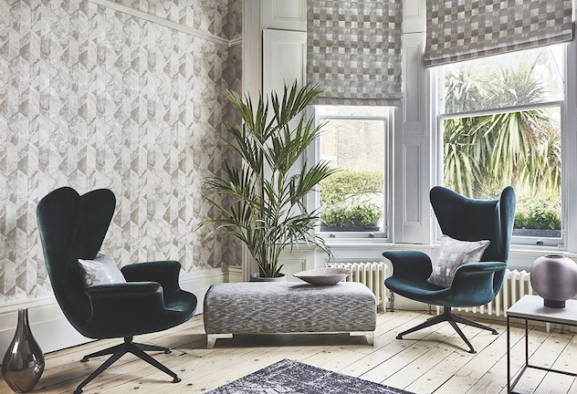
Style Statement
Transform your walls into artistic creations and tie in furnishings and accessories to complete the scheme.
When it comes to wallpaper, experiment with large scale geo designs to maximise the space and introduce small cushions in the same design for subtle co-ordination. Paper the full wall for added drama and work with existing elements, such as picture rails and window features. Contrast busy wallpaper with white ceilings and skirting boards to allow the feature pattern to pop and give a striking finish.
Play with textured semi-plains and striking prints across curtains, cushions and wallpapers that complement one another. If opting for a tonal look, make sure to explore the full spectrum of hues for your chosen shade for a dynamic look. Introduce fabrics and wallpapers with subtle metallic finishes for a glamourous twist.
Pattern Power
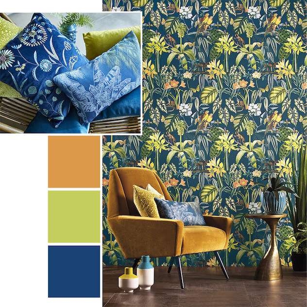
With the desire to reconnect with nature becoming more prevalent in recent years, the tropical trend is a great go-to for injecting the feeling of Summer in the home all year round.
As we long for tropical getaways, interiors inspired by distant shores offer a sense of escapism and including wallpapers into your interior scheme will turn your home into a truly tropical trove. Mix and match patterns that share the theme and explore jungle scenes, colourful foliage and climbing trees.
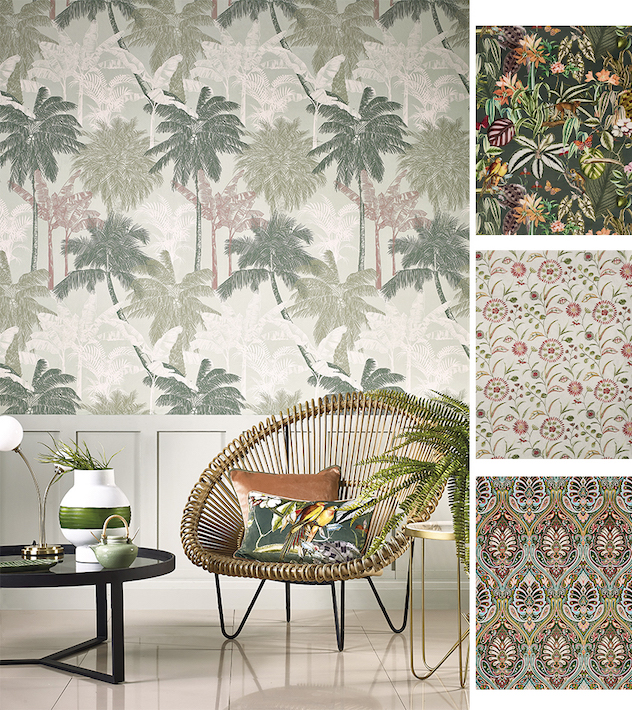
Utilise wall panelling when it comes to busy wallpapers to create a sophisticated, balanced look. Paint the panelling in a hue that matches the colours in the paper. The sage green shade in the St. Vincent Jade wallpaper matches the panelling perfectly, giving a softer finish.
Create a colour palette with a mix of bright hues and muted tones to bring vibrancy to the scheme without overpowering it. Style busy wallpapers with furniture in block colours that complement your scheme. Here the orange velvet chair above brings out the warm, amber tones of the flowers in the Caicos Lagoon wallpaper.
In The Detail
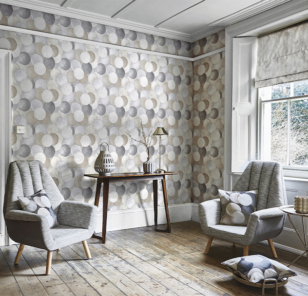
An easy neutral colour scheme can bring a sense of comfort and calm into the home with layered textures and patterns adding interest.
Who said a neutral scheme had to be boring? With added textures and a variety of patterns with a similar theme, you can create a room guaranteed to make an impressive statement.
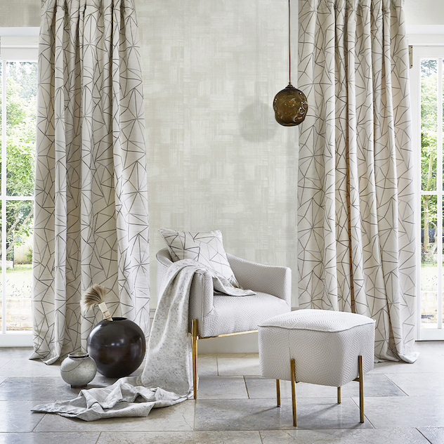
Why not opt for a semi-plain wallpaper to sit with patterned fabrics? Layer textures against a soft wallpaper for a balanced, sophisticated scheme with added interest. Taking inspiration from the industrial era, the Dimension Weaves fabrics and Dimension wallpaper collection features a range of tactile patterns, from embroidered geometrics and mini mosaic jacquards to painterly crosshatch designs and concrete textures.
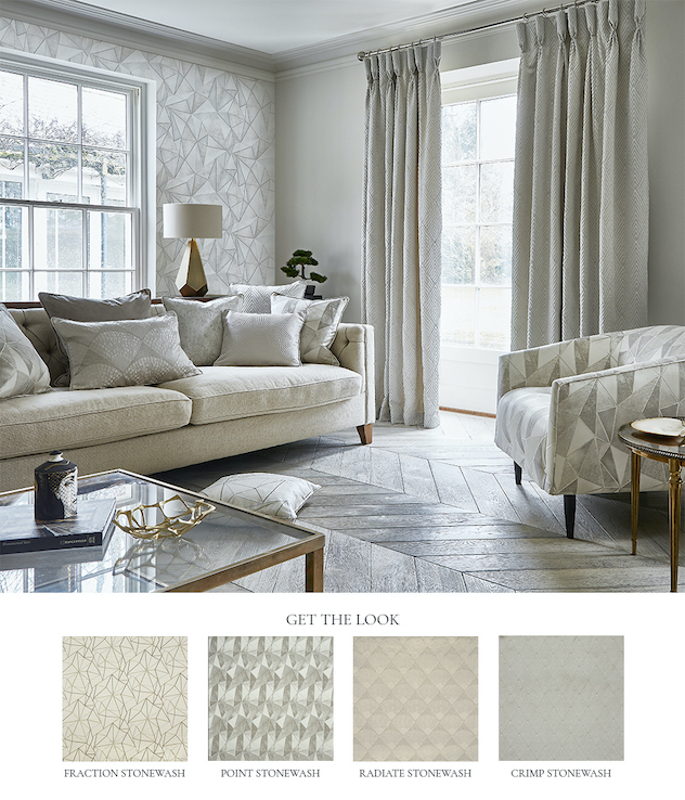
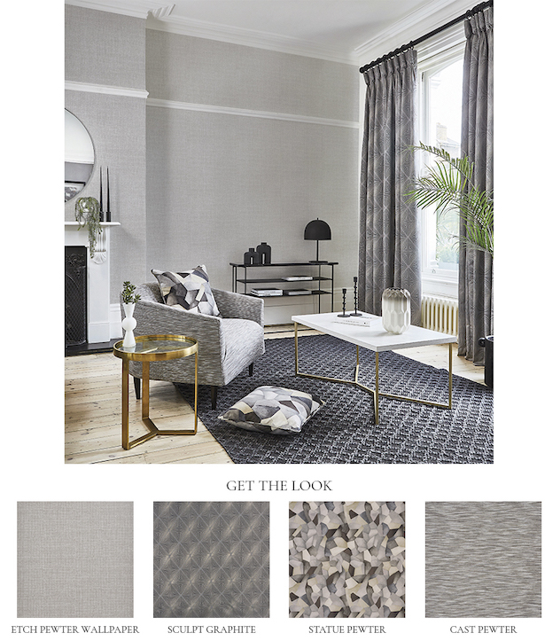
Create focal points in the room with a feature wall and statement chair in perfectly matching wallpaper and fabrics to enhance the theme. Go bold and sit the chair in front of the matching wallpaper or place the furniture opposite the feature wall to connect the room.
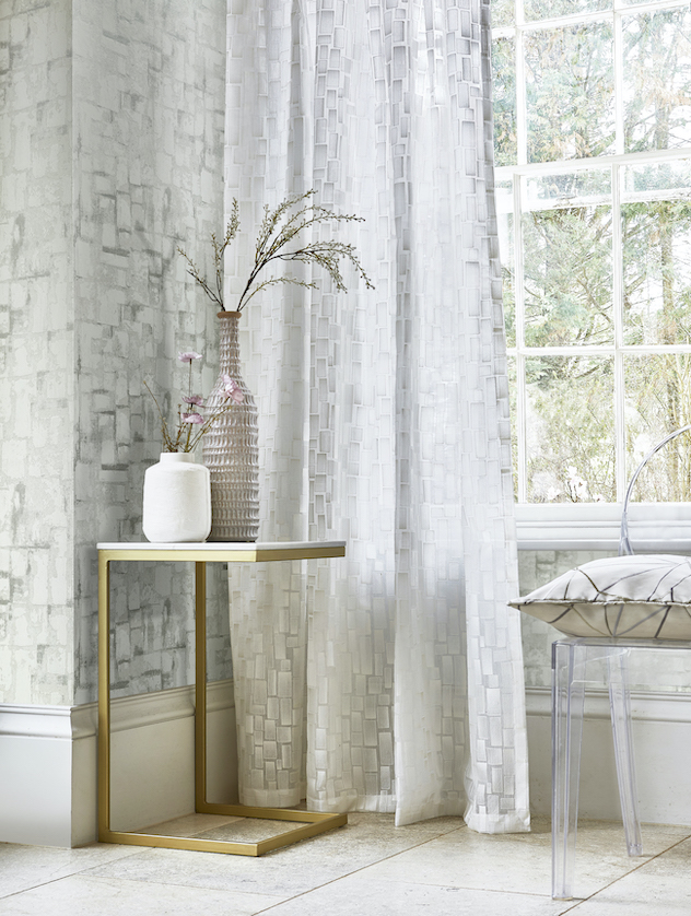
Alternatively, pair fabrics and wallpapers with similar shapes to complement one another. The Particle Chalk sheer from the Dimensions collection co-ordinates almost exactly to the Fragment Chalk wallpaper, carrying the block pattern across the window.