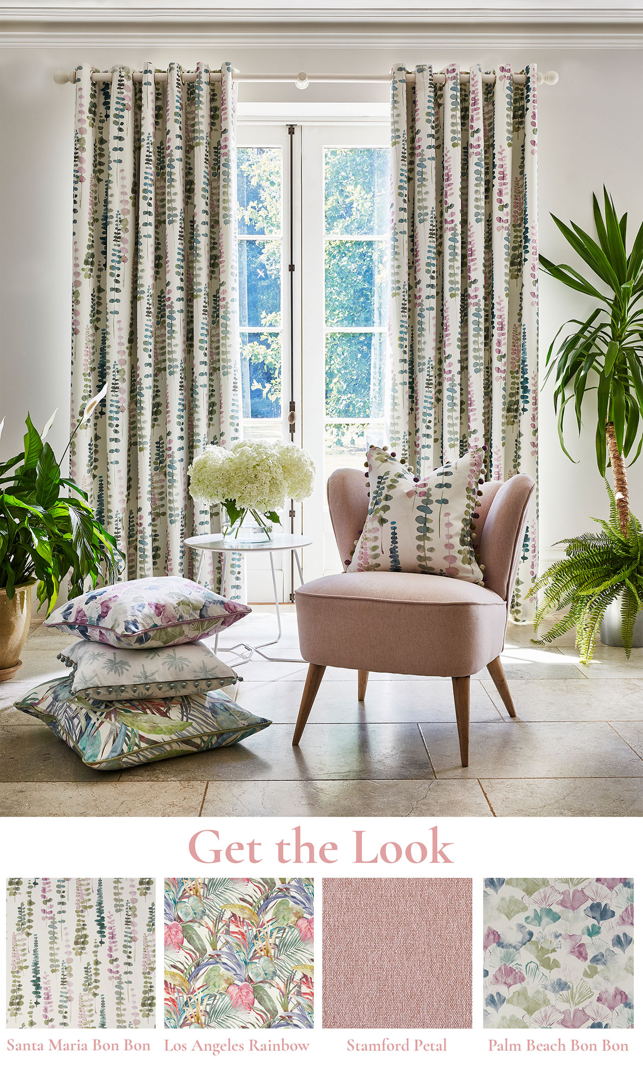
Pastels That Pack a Punch
This season’s pastels see us swapping out pared-back finishes for hues that sing of vibrance and character.
See the world through rose tinted glasses and embrace Summer with open arms thanks to vibrant pastels. Create a scheme that effortlessly lifts spirits and embraces the trend for dopamine décor.
Turn up the saturation and enjoy a space bursting with colour, using the punchy pastels taking centre stage this season. Symbolic of the rise in creating joyful spaces, having a calming home that allows us to detach from the outside world is more important than ever. So, what better way to do this than with a palette of sugary hues? From decorating with vibrant tropical designs to creating a light and airy backdrop using white, take a look below and see how we are recommending you integrate on-trend, impactful pastels into your décor scheme.
Opt for Pastels in Vibrant Designs for a Maximalist Look
Make a statement and add a touch of character with prints depicting exotic destinations and eye-catching architecture, finished in irresistible pastels.
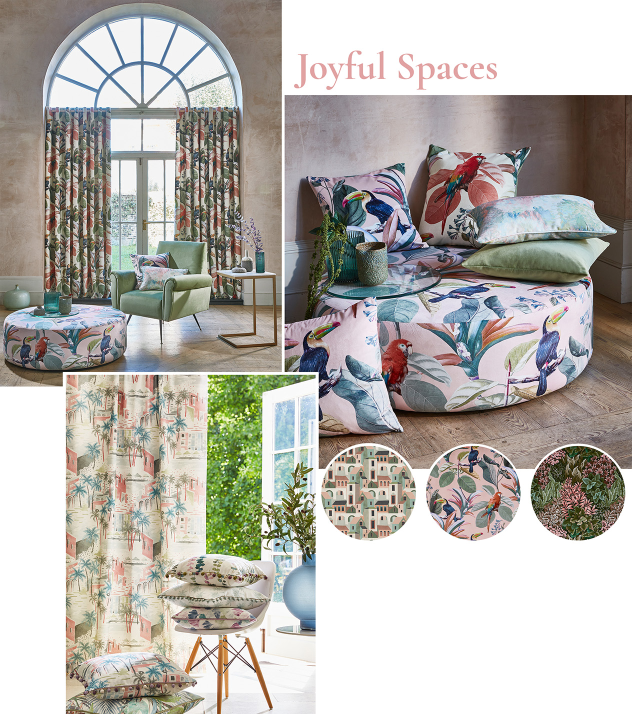
(From Left to Right, Clockwise) Painted Canvas Collection, Cuba Collection, Palm Springs Collection
Heighten the joy inspired by punchy pastels with vibrant illustrations of Cuban architecture, as well as intriguing geometrics presented upon subtly textured base cloths for further impact. Alternatively, look to indulgent velvets featuring playful birds nestled upon trailing leaves or sprawling forestry featuring snippets of pastel hues, giving a nod to the tropical theme. Go all in and upholster a footstool or sofa in a conversational pastel design to create truly show stealing focal points.
Mix with Whites for an Uplifting Style
Use white as your backdrop to a pastel scheme and lay the foundations for an inherently relaxing space.
White is the perfect companion to softer hues, and when used together can create a wonderfully soothing look. Pastels already contain predominant amounts of white, so opt for slightly more saturated hues to avoid a colder space. On the other hand, gentler pastel shades provide perfect snapshots of colour that don’t overpower a scheme. Go with white on your walls or in your furnishings, opting for white wood or wicker for the ultimate laid-back Summer scheme.
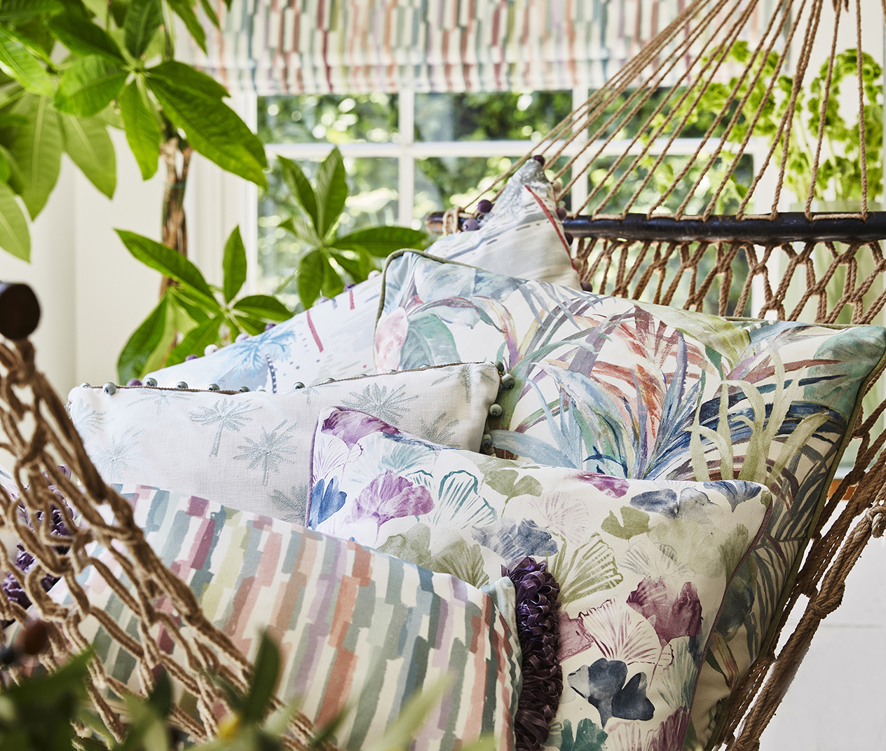
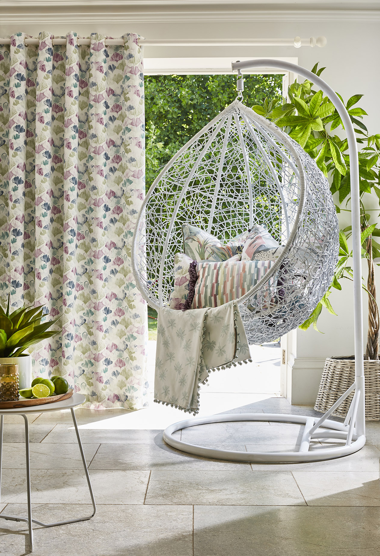
Keep it Laid Back with Natural Finishes
Anchor the relaxed feel of pastel hues with a gallery of natural materials.
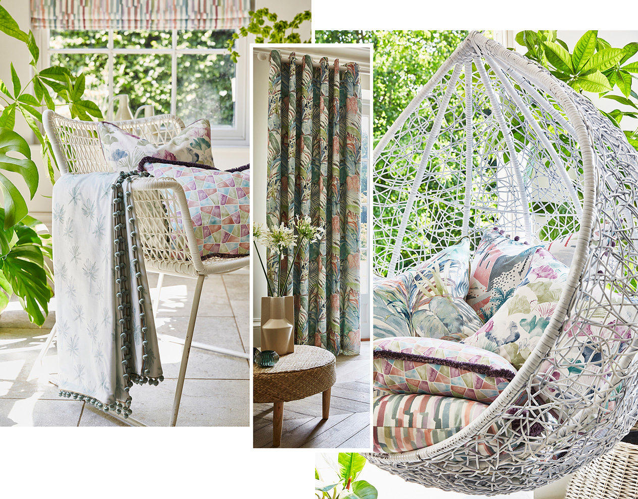
Complement the painterly finishes of Palm Springs and add warmth to less saturated spaces with the warming grain of natural wood. Rattan or wicker are perfect for recreating a truly laid-back space, so why not adorn a rattan chair or sofa with a medley of scatter cushions in conversational prints finished in joy-inducing pastel palettes? Be sure to incorporate sprawling, leafy greens such as oversized palm plants, trailing vines, and tropical flowers featured in your fabrics, acting as an extension of your scheme.
Create a Whimsical Feel with Delicate Florals in Pastel Tones
The softer nature of pastels complements gentle floral patterns, placing a contemporary twist on typically vintage styles
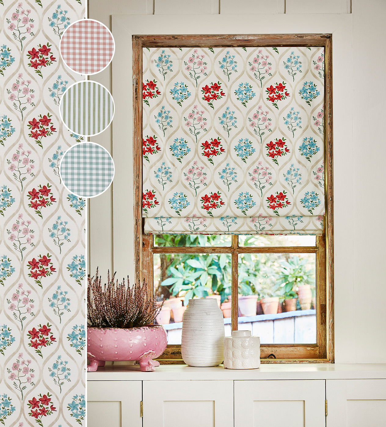
Vintage Collection, Vintage Weaves Collection
Pastels are easy to integrate into a scheme when presented within trailing, small-scale florals, due to the delicate nature of both. Use a mix of complementary fabrics such as prints, gingham, and stripes, and don’t be afraid to use fabrics containing contrasting shades. Look to the hints of deep, indulgent reds featured within Vintage’s Tetbury Poppy design, which contrast beautifully against more subdued cornflower blue and violet tones. Adopt the enduring trend for stripes and incorporate coordinating woven designs in uplifting pastel tones for a touch of nostalgia.
Present Pastels Through Your Window Dressing
Make pastels the star of the show, by showcasing them in the first space your eyes land on when you walk into a room.
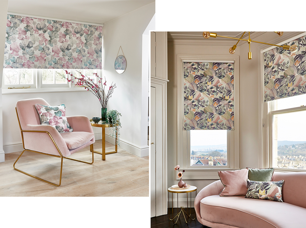
PT Blinds Portfolio Collection in Hanalei Hibiscus and Osaka Green Tea
Why not coordinate your blind with your soft furnishings for a sense of cohesion? Select a pastel tone featured in your blind and present upon a sofa or armchair, adorning with matching scatter cushions for a rounded look. With up t0 50 on-trend designs curated from the PT fabric range, including sprawling floral designs upon irresistible pastels, PT Blinds’ Portfolio Collection contains a characterful design for every living space.
Start Small with Pops of Pastel
Snippets of pastel are perfect for subtly introducing the trend into your home, providing unexpected yet pleasant touches of colour as you make your way around a room.
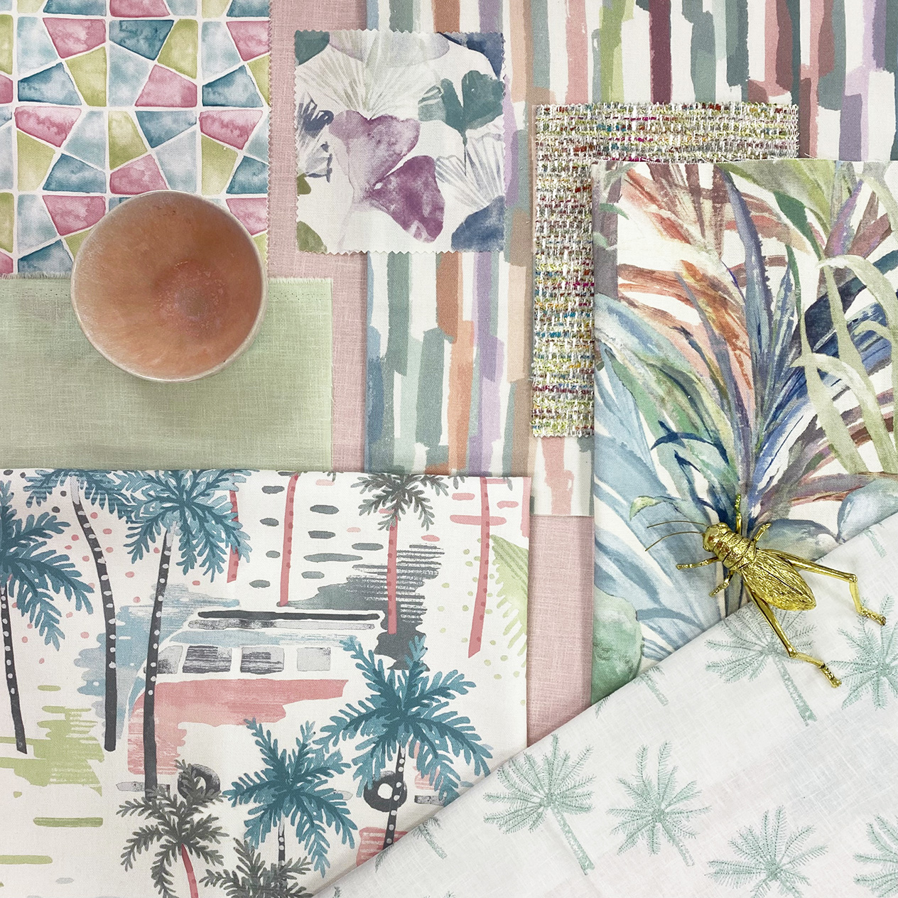
Palm Springs Collection, Tranquil Collection, Runway Collection
Gradually introduce the trend into your home through smaller soft furnishings, such as scatter cushions or throws in subtle pastel finishes. Once you have become more confident, start to infuse pastels on a larger scale, through flowing floor-length curtains, blinds, or larger expanses of furniture. Look to maximalist prints depicting conversational landscapes or vibrant floral scenes to take your scheme to the next level. Select a pastel hue for your walls if you are feeling especially adventurous.
Discover the laid-back yet vibrant Palm Springs Collection, or start forming your pastel scheme by heading to our product search
Discover our latest Pinterest board for more inspiration